Rebranding HTC VIVE's metaverse ecosystem VIVERSE
Overview
HTC VIVE built its name on hardware: headsets, sensors, rooms wired for presence. VIVERSE marked a different ambition, an operating system for the VR world itself, connecting virtual worlds, identity, avatars, and spatial experiences across VR, mobile, PC, and web.
But the brand had launched with a logo that existed only as a moving image. There was no fixed mark, no system, no guidelines. The task: give VIVERSE a definitive identity, and take it live in the shortest possible time.
Design Concept
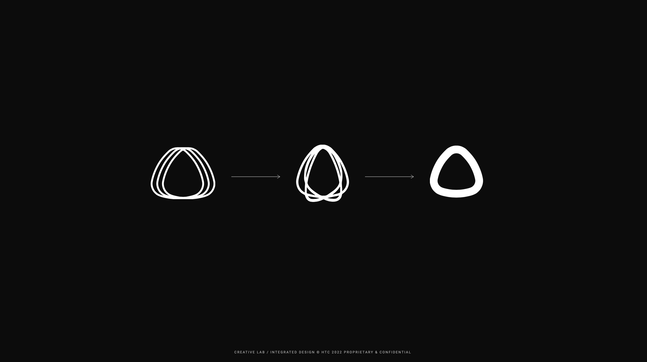
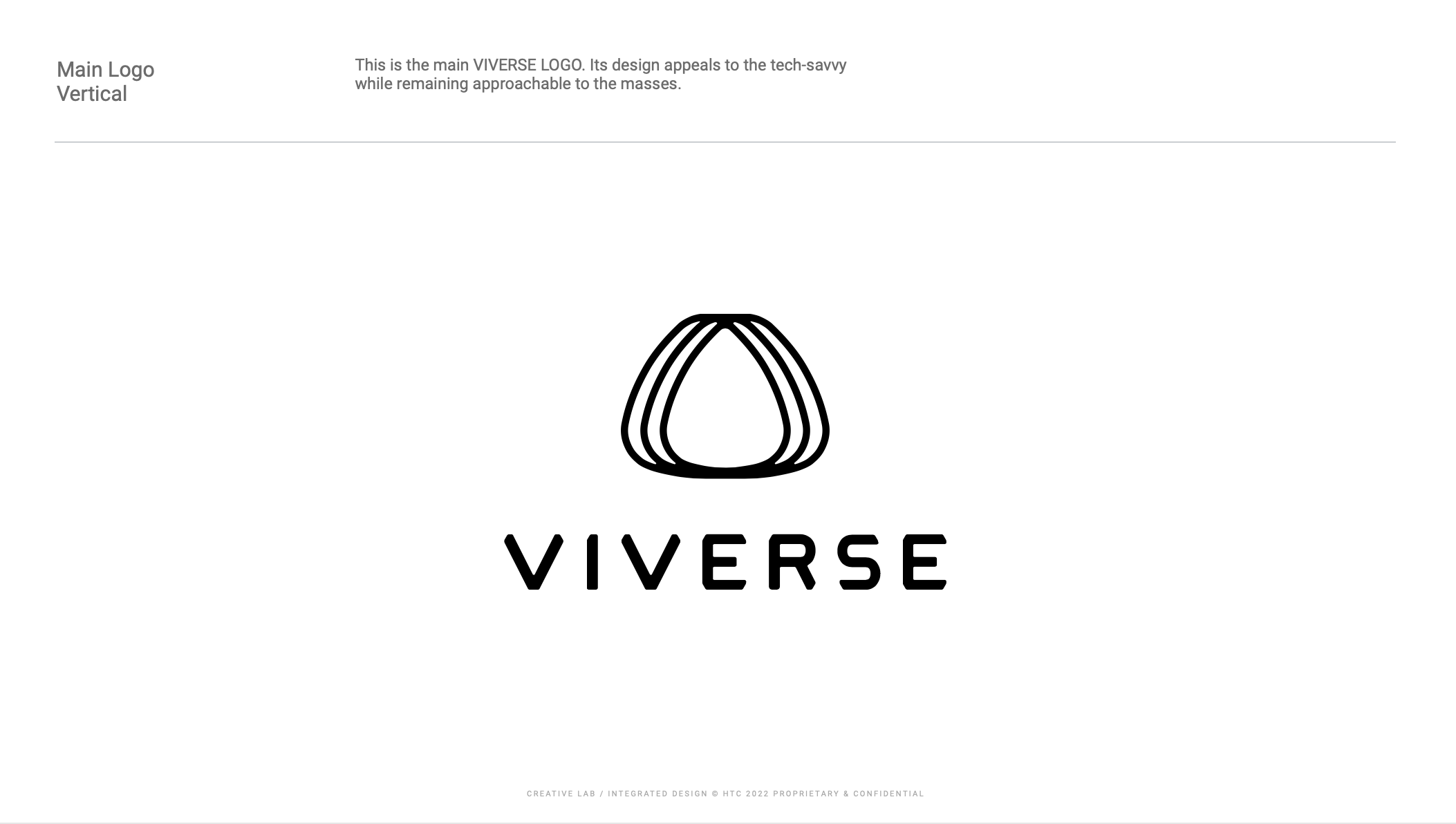
The new mark evolves directly from the VIVE logo, reshaped to carry three meanings: a portal, a transformation, an extension. It signals that VIVE is no longer a company selling VR devices, but the gateway to an entire virtual universe. The logomark and its custom letterforms were refined in parallel, detail by detail, into one coherent mark.
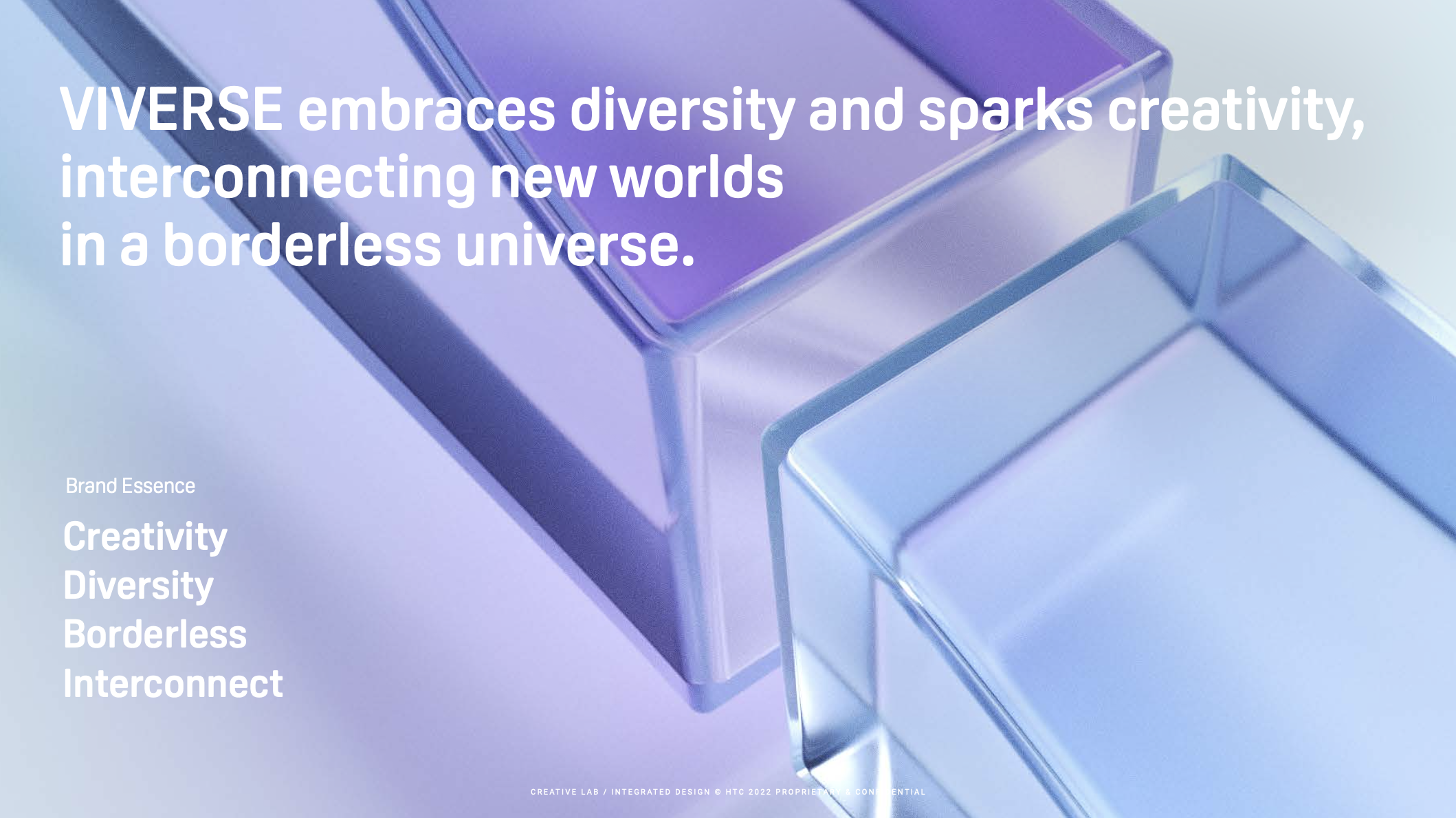
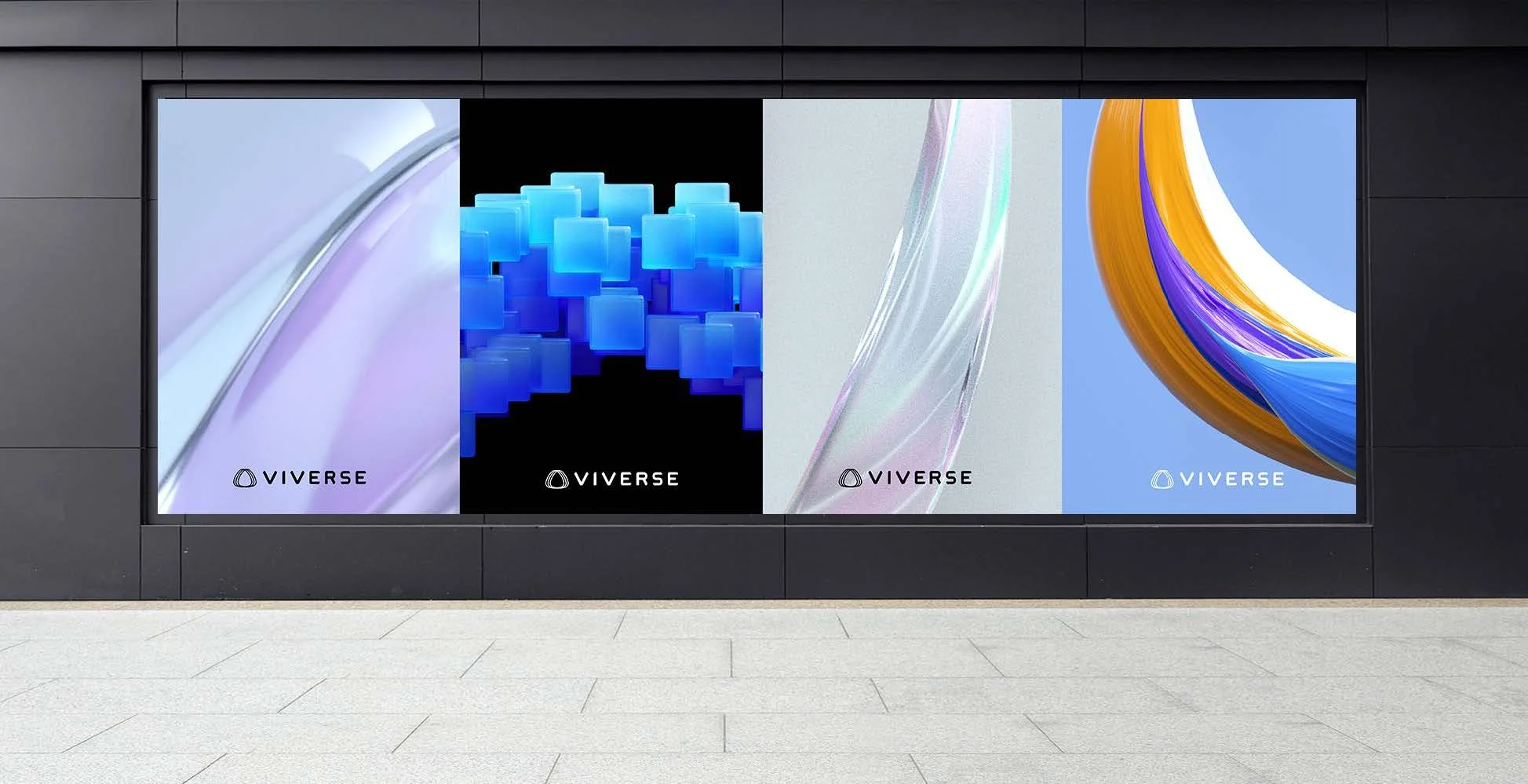
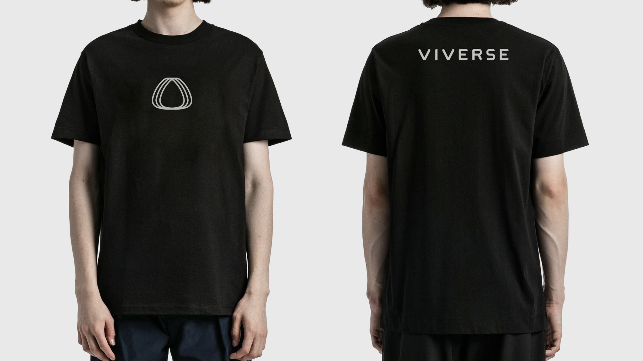
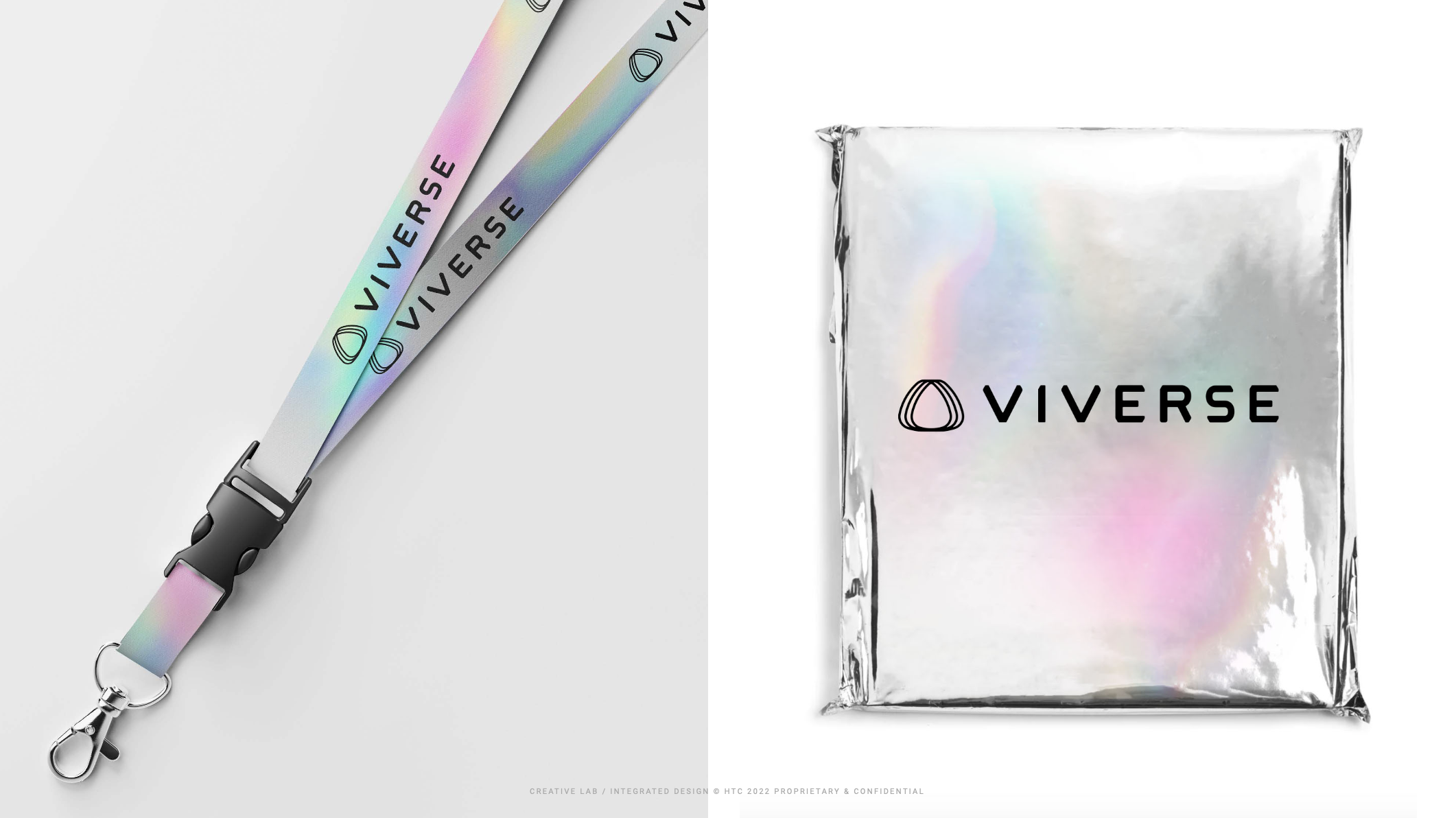
The brand essence was defined through four values: Creativity, Diversity, Borderless, and Interconnect. A universe where information stays transparent, where users create freely, where you are bold enough to be yourself, and where worlds connect. Each value was translated into a motion visual, developed in collaboration with the in-house animation team, and the system extended to the new website homepage and the applications VIVE needed most for exhibitions worldwide, from apparel to lanyards.
Role
Ann led the project as Senior Brand Designer at HTC headquarters' Creative Lab, aligning stakeholders across management, directing animators and copywriters, and delivering the identity from concept to launch.
Out of respect for HTC's confidentiality agreements, only publicly released materials are shown.
Scope: Logo refinement, identity system, motion& web visual direction, applications
Brand: VIVERSE (HTC VIVE)